


The Book & Its Cover
The Waters: 60 Days to Splash Down

We’re told not to judge a book by its cover, but a cover is a carefully designed work of marketing art that calls out to the world, “Here, look inside! It’s a book you should read!” And until you read a book or hear about it from someone you trust, you have no other way to judge it.
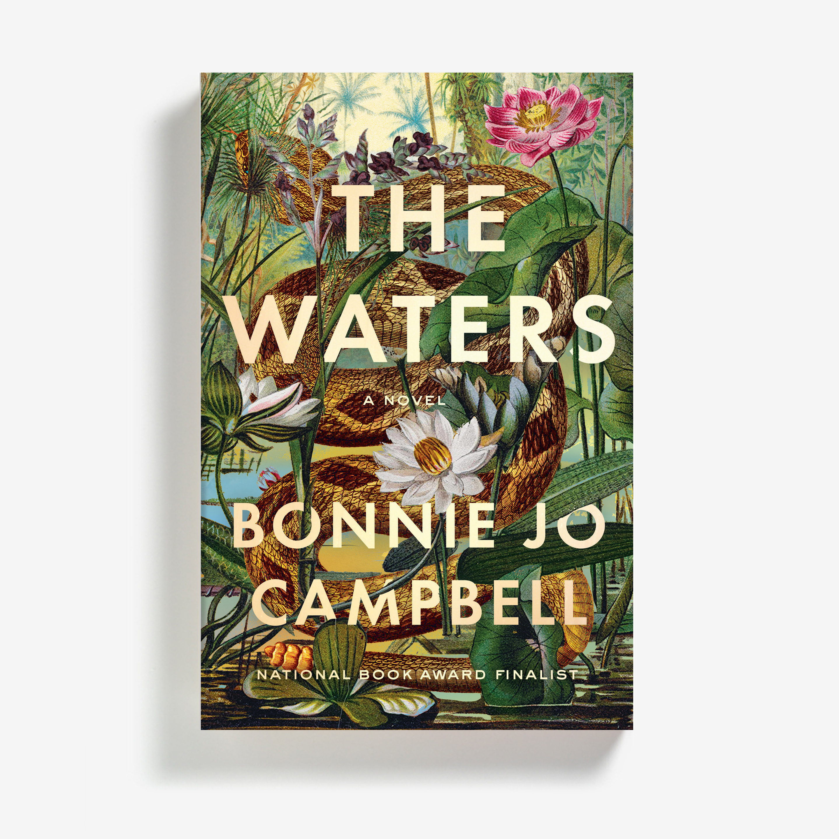
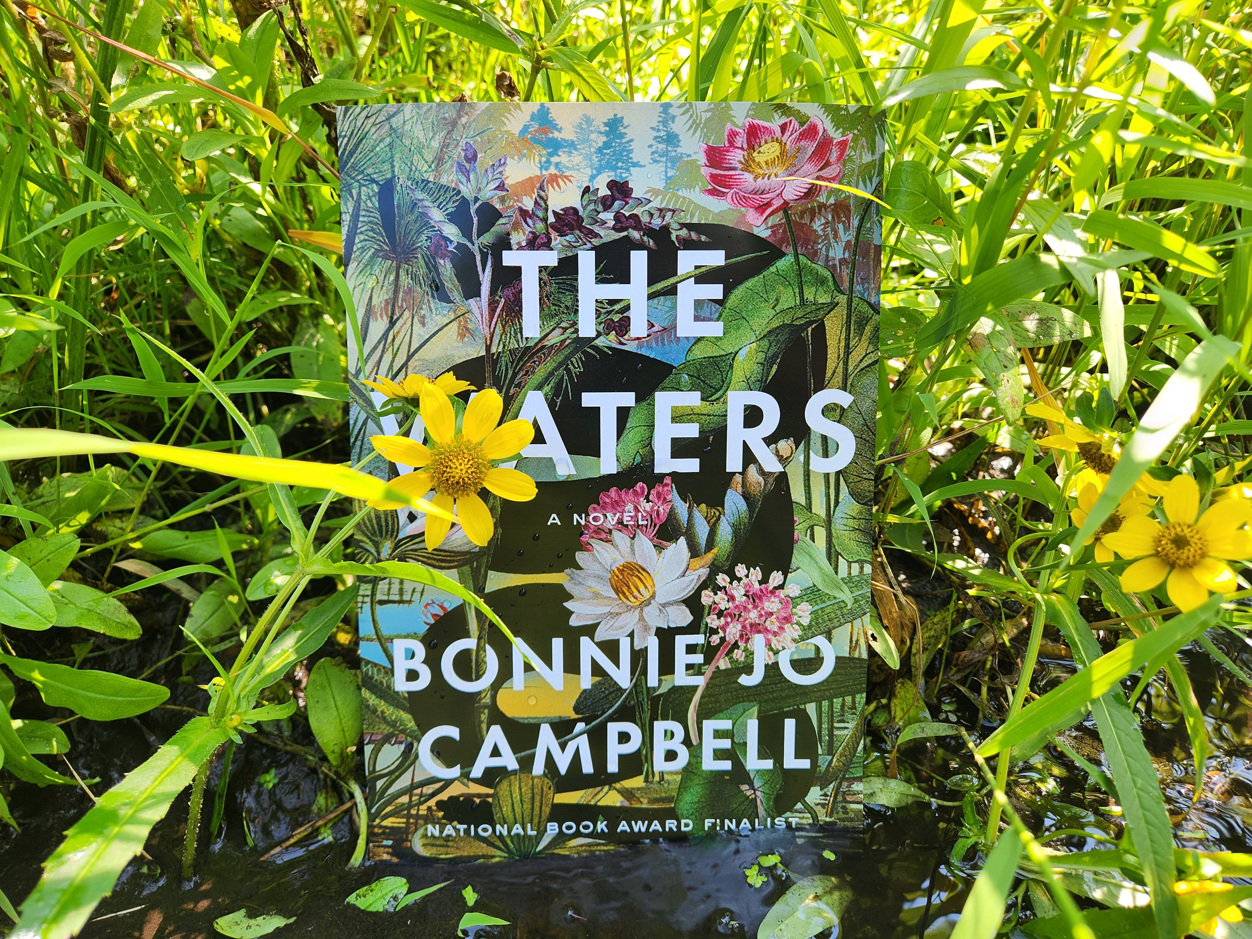
In traditional publishing, a lot of people think about a cover before it appears in the world—an editor, a designer, the author, possibly an agent. Plenty of people judge a cover before the anyone strolling through a bookstore does. I love the cover of my new novel The Waters. I have it as a screen saver on my phone, and I made a waterproof copy of it, submerged it in water and took photos of it.
At first glance, the cover scared me. Like the novel, the cover features a serpentine element, and I worried that readers might be made uneasy by a snake. Also, I’d seen fantasy books with snakes on the cover. Would people assume this is a fantasy book? Well, it’s true that it’s a somewhat fantastical book! Those of you who know me well know that I worry about everything.
WW Norton initially created two covers, one with the snake sparkling in desert rattlesnake colors so beautiful that I couldn’t stop looking at it. However, the one that seemed right for the book was a vision with the snake as empty space. That fits the character of Michigan’s swamp rattlesnake, the Massasauga, which you will probably never see in real life, even if said snake is within a few feet of you. Plenty of people look at the cover and do not see the snake for the gorgeous flowers. As it should be.
One friend expressed a concern that The Waters cover was “off brand” because it didn’t look like my other books. I mentioned this to my fabulous agent, and he said. “You’re right. It looks like a best seller. That’s what it looks like.” I said, thank you, and Vive La difference.
Way back when my first book Women & Other Animals was published, the University of Massachusetts Press asked me to suggest cover art and then they used the painting I suggested, of a woman eating a little man. At Wayne State, the editors initially wanted a collage cover for American Salvage, but upon consideration, they agreed with me that a photograph by Mary Whalen made sense, and that same striking photo was also used in the W.W. Norton reprint version of the cover.
When Scribner published my first novel Q Road, they chose a wood-grain cover with tiny sketches on it. I liked it, though my friend Mary said that the faux naif trend was already passe (and she can say these things because she actually speaks French). It turned out that the real problem was in the wood-grain background. It turned out that it blended in with the shelving in most bookstores and negatively affected sales.
When Simon & Schuster produced the paperback, they used an image of a barn with a chicken in the window. Because the image was from stock images, the same photo was used seven years later on the cover of Ron Rash’s book of stories, Burning Bright.
The slam dunk cover was Mothers, Tell Your Daughters. One day W.W. Norton sent a cover image of a world-weary pre-pubescent girl in a truck, and I fell in love. In art, color, and concept it was perfect. In fact, it seemed so right that lots of folks assumed it was a picture of me. I began telling people it was a girl from the neighborhood, Autumn Dodge. She signed copies of my book at my hometown book release.
The most difficult cover to nail was the one for Once Upon a River. We tried a cover with a girl in a dress, one with heavy lettering on a plain background, another of a tree. We were on the fifth cover concept—and I believe the WW Norton team might have been getting fed up with their new author—when Ingsu Liu, Executive Art Director, produced a cover featuring a beautiful old wooden rowboat. I wept with joy, and I expect so did my editor.
That cover was judged brilliant by book-buyers, and I felt good every time I saw the book, every time I presented that book in public. I still love it! And after all, it is the author who spends the most time with the cover of her book. So thank you Ingsu Liu and everyone at W.W. Norton, which I want to remind readers is an independent, employee-owned company celebrating its 100th anniversary this year.
That first cover scares me! The current cover does look like a best seller! Bravo!
“You’re right. It looks like a best seller. That’s what it looks like.” 👏🏻👏🏻👏🏻